Services Provided:
- Brand Identity
- Logo Design
- Packaging Design
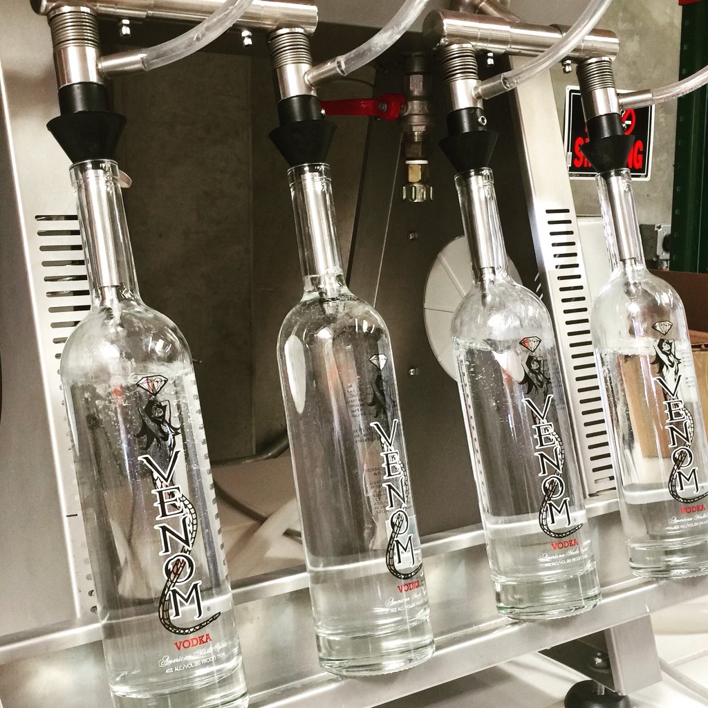
The original Venom logo featured a female figure with a snake’s tail, combining themes of temptation, danger, and seduction. While distinctive, the identity felt tied to a specific era of spirits branding and relied heavily on illustration to communicate the brand’s personality.
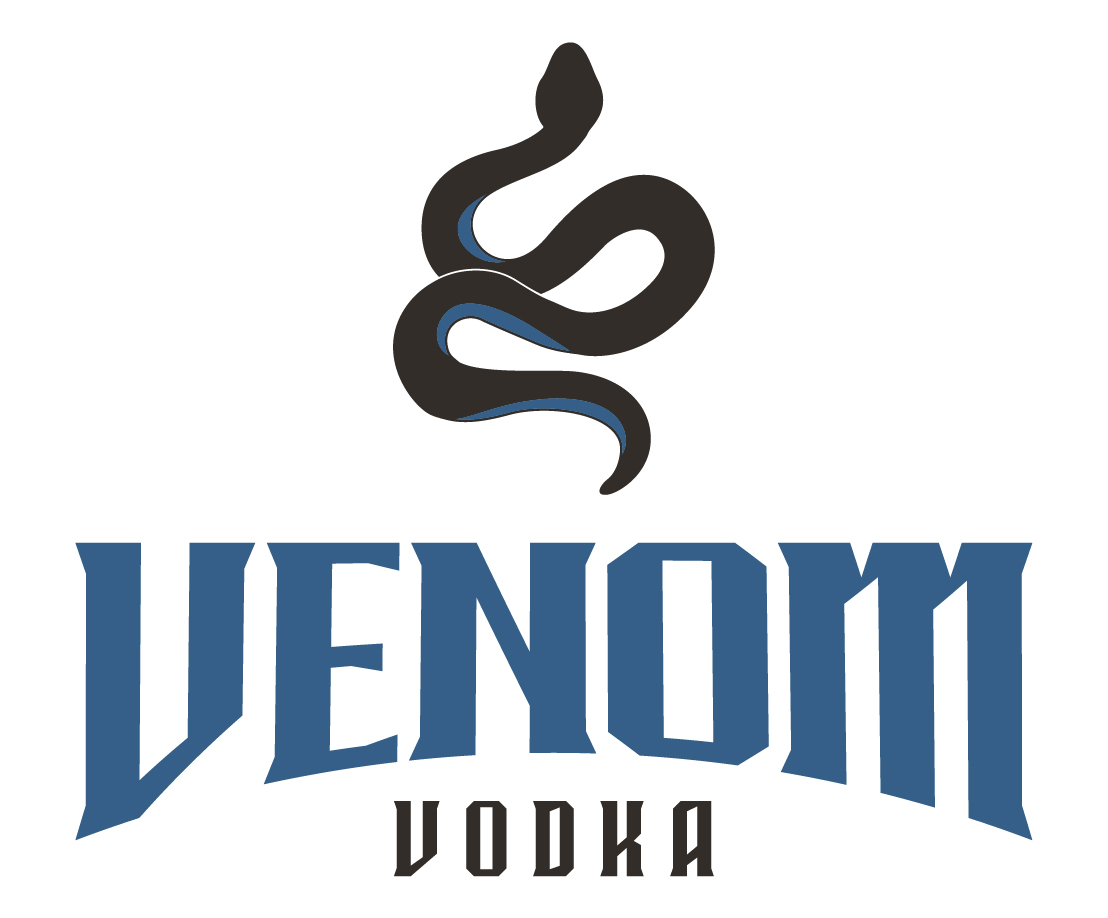
The goal of the redesign was to modernize the brand while preserving the core idea behind the Venom name. Rather than focusing on a character, the new identity centers on a stronger, more recognizable symbol that can grow with the brand and work across a wider range of applications.
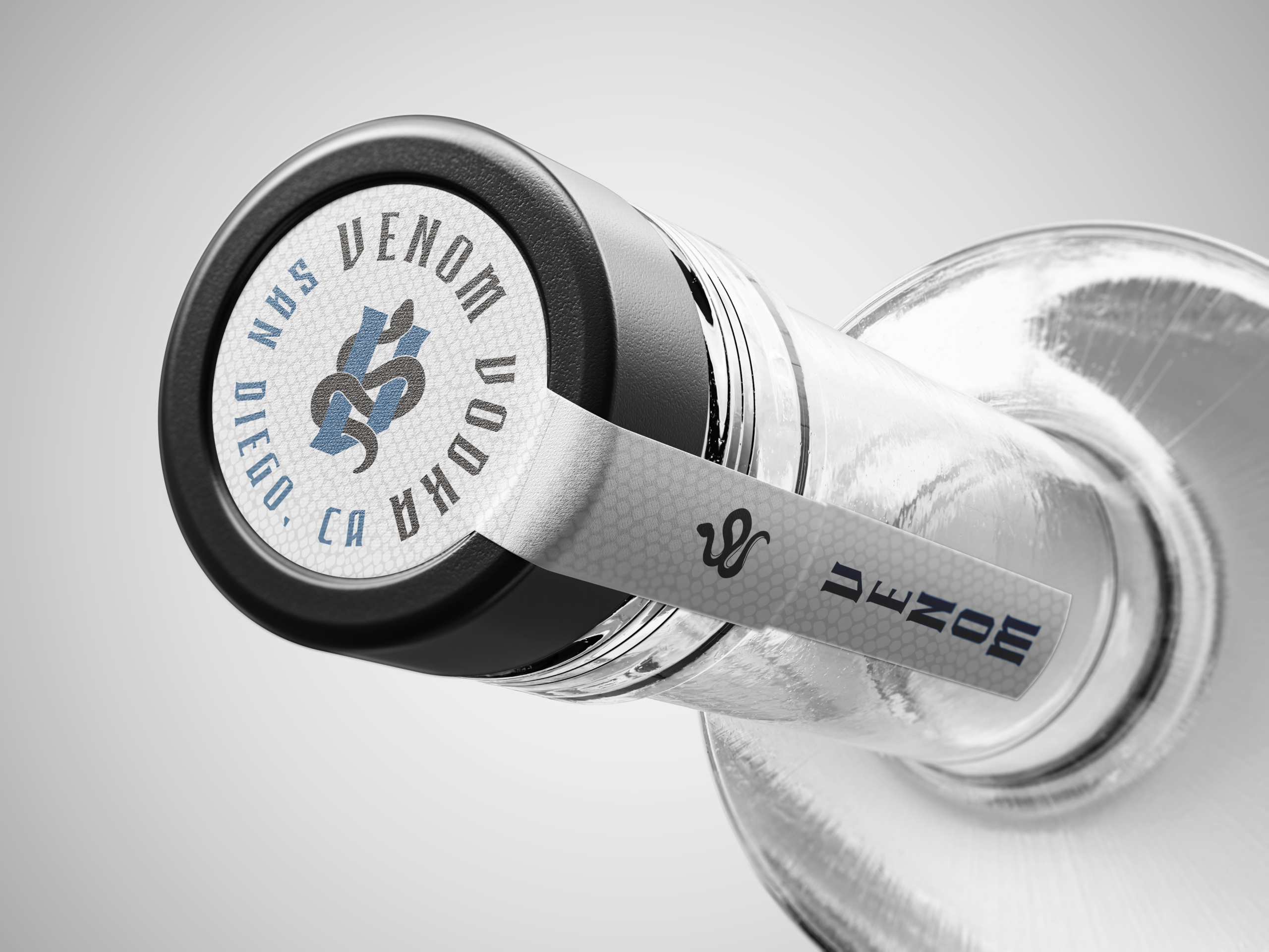
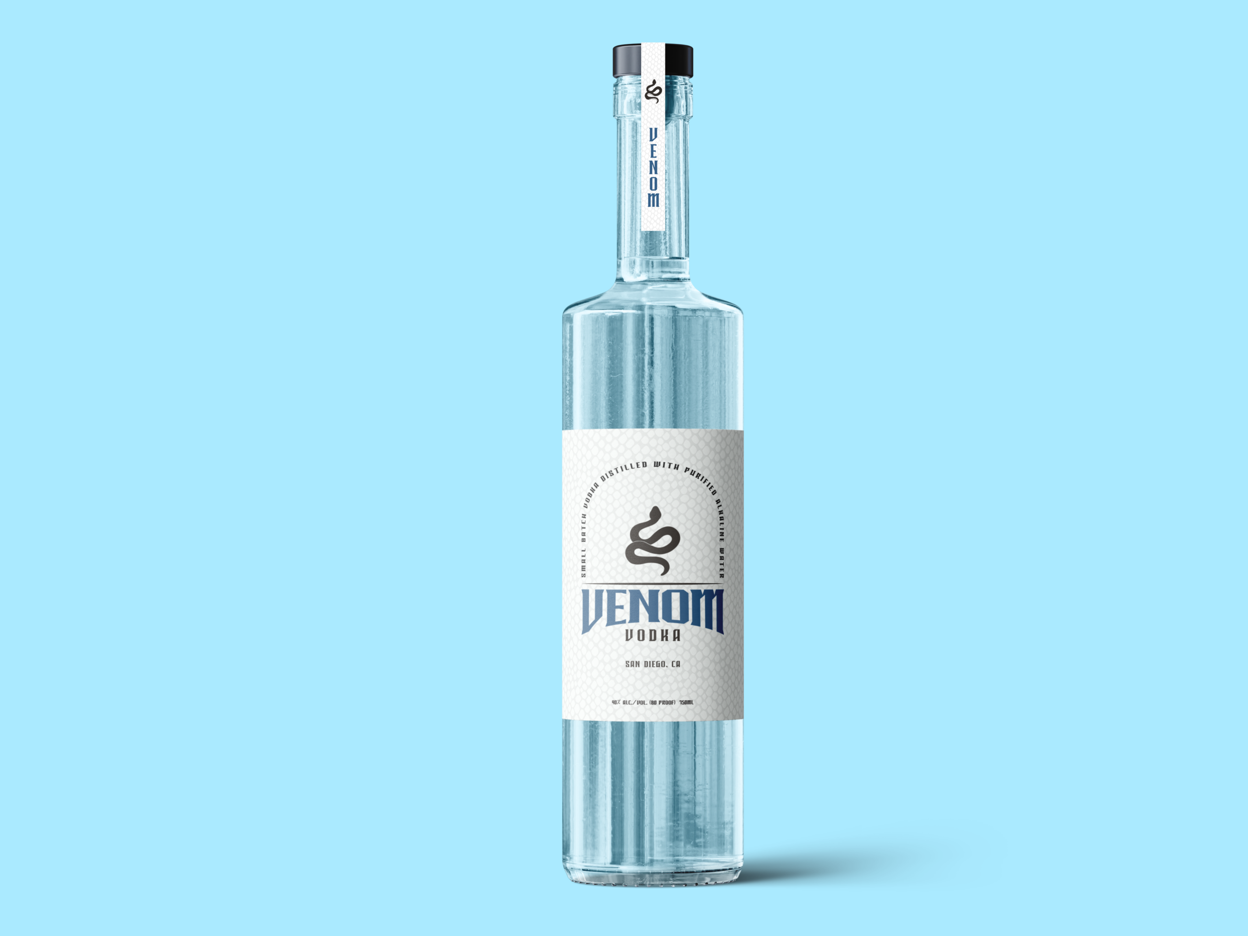
At the heart of the new identity is a simplified snake silhouette. The snake remains an important part of the brand story, representing power, transformation, confidence, and controlled danger. By reducing the concept to a clean graphic symbol, the brand becomes more versatile, memorable, and premium in appearance.
The typography was selected to complement the symbol. Sharp angles and bold forms give the logo a sense of strength and attitude, while maintaining a clean and professional look. The result feels modern without chasing trends, allowing the brand to stand out while remaining approachable and timeless.
The color palette was intentionally restrained. Deep charcoal, white, and muted blue create a balance between sophistication and edge. The blue helps reinforce ideas of purity and clarity, while the darker elements provide contrast and strengthen the connection to the Venom name.
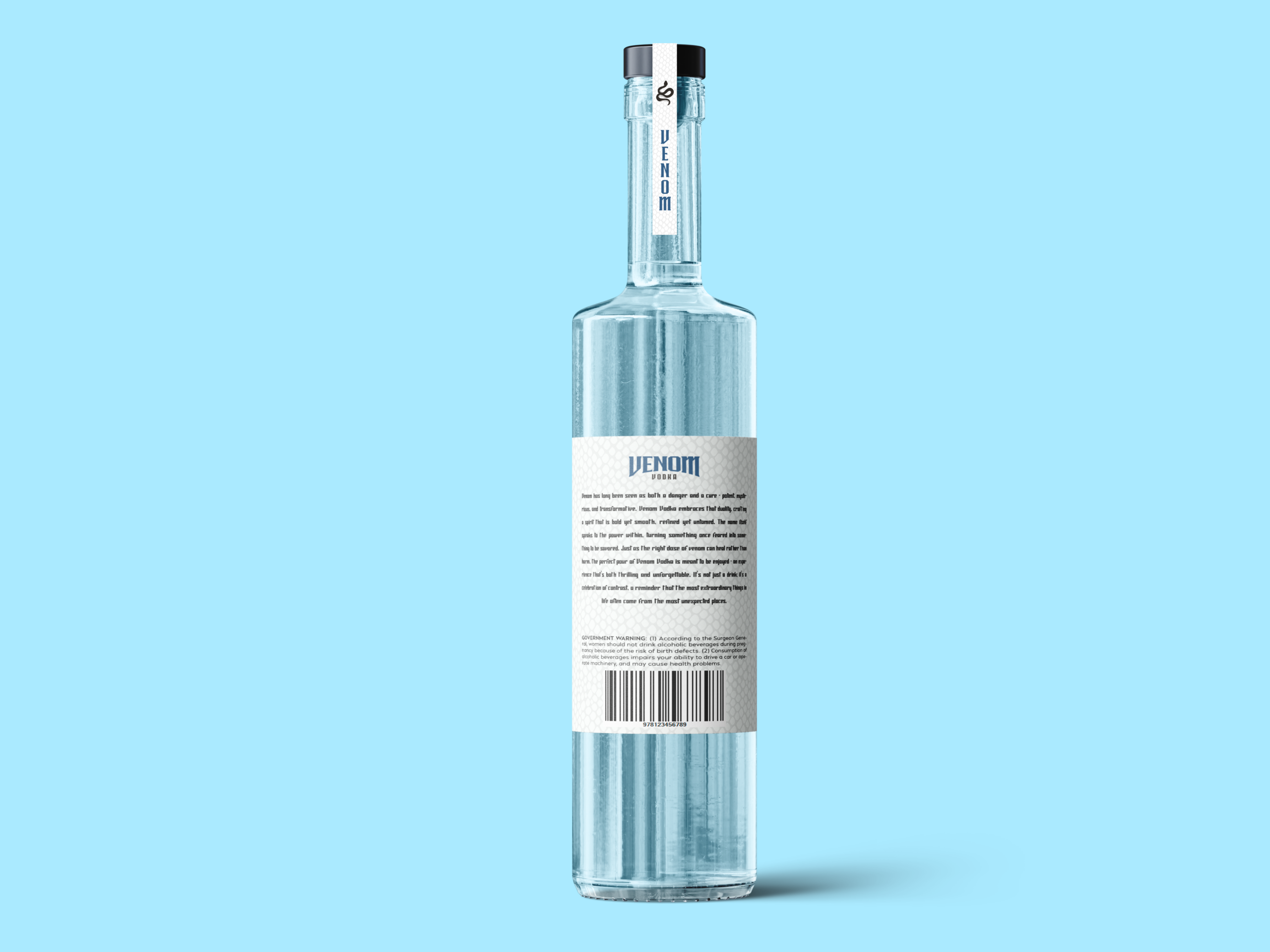
The bottle design follows the same philosophy. A tall, clean silhouette, minimal label coverage, and refined details allow the product itself to become part of the presentation. The custom seal, bottle cap graphics, and supporting badge system create a cohesive identity that feels considered from every angle.
The redesign transforms Venom from a brand built around a provocative illustration into a complete visual system with greater flexibility and shelf presence. The identity still carries the attitude and intrigue that made the original memorable, but presents it in a way that feels more premium, confident, and relevant to today’s spirits market.
The final result is a cleaner, stronger brand that communicates quality first, while still embracing the bold personality behind the Venom name.